THE CHURCH OF ST MARY OF THE ANGELS
The Church of St Mary of the Angels is a catholic church, striving to pursue their vision - To Know Christ, To Love Christ, To Serve Christ.
Come 2020 would have been their 50th anniversary, and they aimed to create a logo to produce merchandise.
This is my conceptual design.

scroll
Photograph taken from SMOTA site.
WORKING DRAFTS
Worked through version with different elements and styles :
- cartoon vs realistic
- coloured vs greyscale vs line work
- headers


LOGO DESIGN
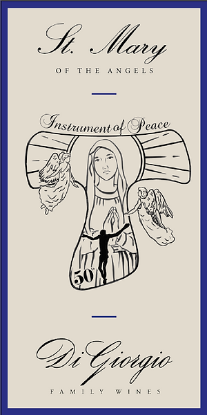
The Tau cross is an important element in the St Francis community, along with the story of Mother Mary. This has been the direction the concept has taken. With the foundation of the design laid down, I moved on to capturing the essence of the church. Having been there on multiple occasions, I've noted that the church is is full of light, and positivity. At the same time, they adopt a more modern exterior to make the overall environment elegant and able to adapt to present-time.
This led me to include elements such as the angels, and the stained glass aesthetic. The idea of angels is a nod to the Archangels that are involved in the Catholic community, while the stained glass aesthetic was inspired by the culture and history that stained glass windows have played in telling the stories of the Bible. This also glorifies the entire image. The use of a sun-like halo venerates Mary and gives her and the entire design a sense of warmth, even while being devoid of colour.
Further along the design, I reillustrated the entire logo to make it more elegant, and steer it away from the cartoon-style illustrations. This reflected on the modernness of the church itself. The absence of colour was to keep it simple, leaving all the attention on the line work and imagery.
WINE LABEL MOCK UP
